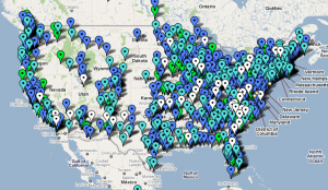
These days, if you use the church finder at UUA.org, a nice map of your state pops up with it. I’m not ungrateful, but I did want a global view — perhaps with a bit of clarifying detail; see below — and when you work with a bunch of terribly clever people, some of whom scrape, repurpose and report on data every day, I was just prone to take matters into my own hands.
Click here — no embedding, I’m afraid — for a Google map of the UUA, as I see it anyway. (A screenshot follows, for reference.)
Or you can download the KML file directly from http://boyinthebands.com/uua-map.kml but for God’s sake don’t use it in Google Earth, since it’s my first serious attempt at this markup and it could use some work.
A couple of things. Even from space, it looks like the Unitarians and Universalists filled in the United States, east to west, as far as I-35 and then realized they were running out of paint. “Dab in the Front Range, outline the Pacific coast and we’ll get those square states later.”
But zoom into the map and you’ll see there are big gaps in the fabric east of the Alleghenies, too. Â And the Deep South has huge unserved areas, even where there are market towns of considerable size and regional influence. (My next attempt at mapmaking will be to superimpose micropolitan areas onto this map, to point out some likely places to spawn new church development.)
I color-coded the pins, matching the UUA size categories, and in one case subdividing it.
- White. Emerging congregations.
- Light blue. Congregations with 35 or fewer members. These are included in “small” but function differently than larger ones — and make up such a large number of recently-developed congregations.
- Blue. Congregations with 36 to 149 members. These are the rest of the “small” churches.
- Green. Medium-sized. 150 to 549 members.
- Red. Large. 550 members and more.
- Yellow. I’ve put the Church of the Larger Fellowship (a postal and internet extension church) and the Unitarian Universalist Church of the Philippines (really a national denomination in its own right) in their own category, as they don’t quite map on to this schema.


Interesting…I think if you overlaid a population density map that would explain a lot…
Not to be picky, but Albuquerque First is a Large Congregation and you missed our branch in Socorro. Also there are a couple of large churches in Denver.
@Christine. Drill down; both are on the map.
Regarding the (clever) I-35 comment: it’s not just the Unitarians/Universalists – it’s Mother Nature. The UU map mirrors the general US population distribution. Take one of the maps at http://projects.nytimes.com/census/2010/explorer?ref=us
and zoom out to the full US – it gets pretty sparse past the 100th meridian – the edge of farmable rainfall. (For a book on the subject, see Wallace Stegner’s “Beyond the Hundredth Meridian.”)
I don’t know your region of origin, but this fact of nature and geography seems to be under-appreciated by many of those east of the 100th meridian – sort of a variation on the famous New Yorker cover of the New York and the rest of the country. I think this plays into the UU regionalization planning – the “West” is just a single place. Not.
Tom, I’m a Southerner living in Washington, D.C., which is why I used the “wide open spaces” trope to lead to my observations about opportunities in the mid-Atlantic and South.
Fascinating, Scott. It probably tracks very neatly to US density maps though certainly not perfectly. My own county has a population of nearly 3 million yet we have just three congregations with their own buildings and less than 800 members. A mere speck in the population.